 Block
Page change Block
Page change
Block
Page change Block
Page changeThe control element is available in two different views, Block and Basic Screen. Depending on the design of the visualization, the element is shown in the following two variants:
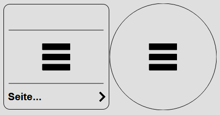
Clicking on the control element switches to the target page. Depending on the configuration, a PIN prompt can also be shown.
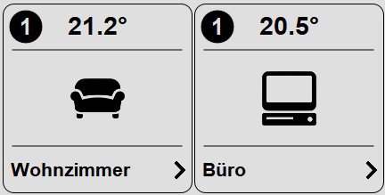
Optionally, a status can be shown on the control element (number at the top left). This status indicates whether light or other loads are switched on on the target page. This way you can see immediately in the menu when a light is still switched on in a room. Depending on the configuration, these can also be other loads.
If the target page itself contains page calls (e.g. a menu page with the individual rooms), the parameter Depth allows the pages reachable from there to be included in the status as well. Each page is counted only once, even if it can be reached via several paths.
Display |
|
| Display | Display Block, Basic Screen or List. |
| Text | Text to be shown. The size of the
text is automatically scaled with the control element.
Line breaks can be inserted with the special character "\n",
for example "Line1\nLine2", a maximum of two lines is possible. |
| Icon | Icon shown centered on the
control element. |
| Status | This option shows how many lights are switched on on the target page. The control elements Block Light Dimmer, Block Light TW and Block Switch (with the option "Page change status" enabled) are evaluated. |
| Depth | Only visible if "Status" is enabled. Defines how far nested
page calls are included in the status: 0 = target page only 1 = additionally all pages reachable from the target page via a page call 2 = one further level and so on The control elements "Block Goto page" and "Button Goto page" are followed. Each page is counted only once; jumps back (e.g. back to the menu) do not cause double counting. |
| Page structure | Only visible if "Status" is enabled. The button opens a menu showing the target page and all page calls reachable from it as menu and submenus, each with its depth. This makes it easy to see how the pages branch and which depth to set. Clicking an entry ("Apply depth N" or a page of the last level) applies that depth directly. |
| Inversion display | Shows the button inverted on the current page.
This way the currently opened page can be highlighted in a menu. |
Value display |
|
| Formatting | Format for the display of the
connected variable, see Format specifications |
| Factor | Optional factor, value is multiplied
by this factor. |
| Offset | Optional offset, this is added to the
value. |
Page change |
|
| Consider user | This option evaluates the created users. When
activated, the currently logged-in user must be linked on the
target page, otherwise the page is not switched to.
If the page is not linked to any user, it is always visible for
all users. See also User management |
| PIN | Optional 4-digit PIN. This
is prompted before switching to the target page. This can
for example be used for parameter pages that not
everyone should have access to. |
Connected variables |
|
| Actual value | Optionally, a variable can be
connected here, the value is shown in the title bar of the
control element. |