 Visualization Editor
The visualization is created with the visualization editor.
Pages
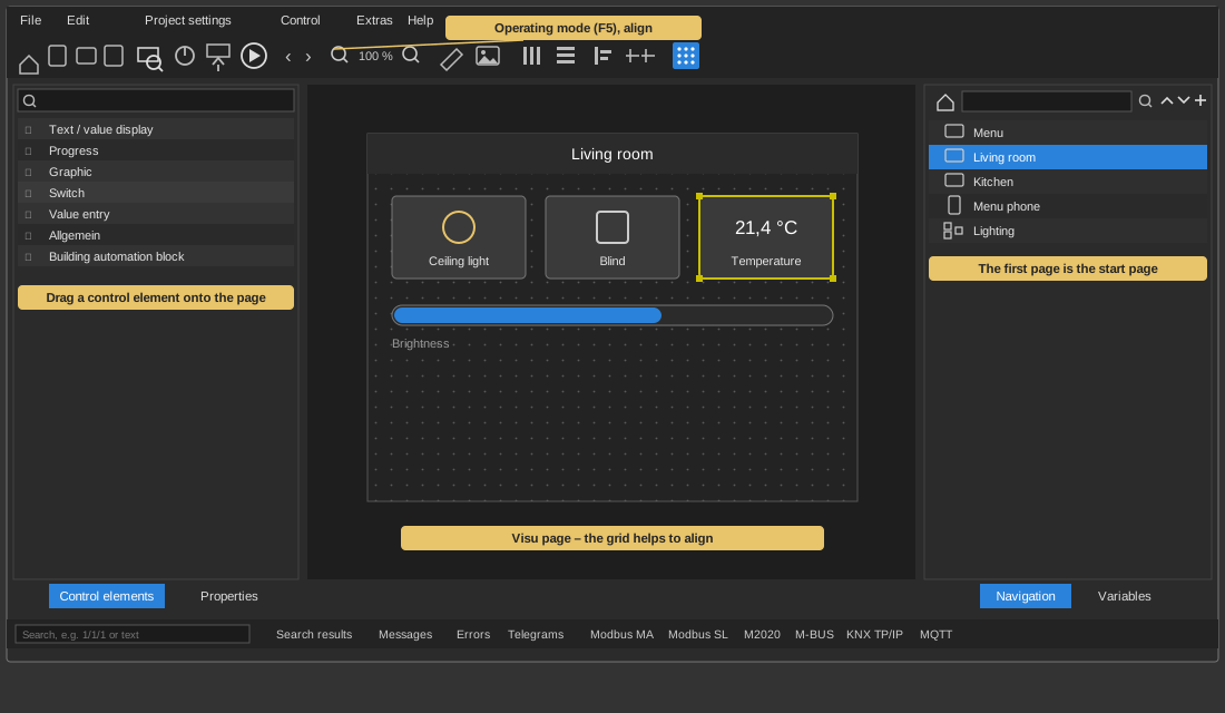
The pages are managed on the right in the Navigation
window. A new page is created with the "+" symbol, its menu offers New
visu page (Ctrl+N). With New folder
the pages can be grouped, the arrows "Up" and "Down" change the order and
the "–" symbol deletes the selected entry. A right click additionally
offers Rename, Clone
page, Properties and Set as start page.
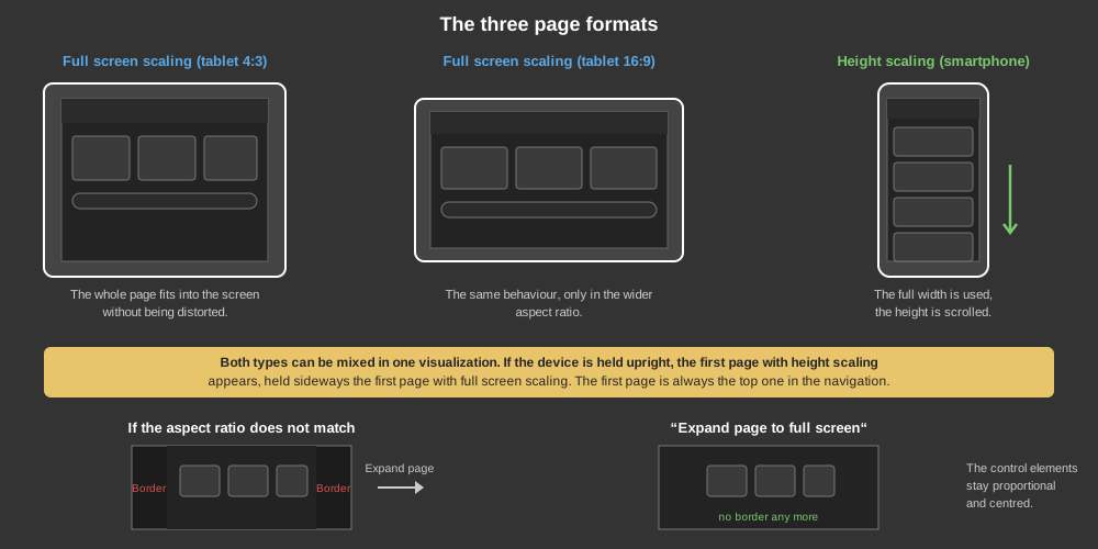
For a new page, the following formats can be selected:
- Full screen scaling (tablet 4:3), this corresponds to the aspect ratio
of iPads.
- Full screen scaling (Tablet 16:9)
- Height scaling (Smartphone)
A distinction is made here between two scaling options:
- Full screen scaling: In this
scaling mode, the visualization page is scaled so that it fits into the
screen without deformation. This scaling is suitable, for example, for
tablets that are held horizontally.
- Height scaling: In this
scaling mode, the entire available width of the screen is used and
scaled in height. The height is then scrolled. This scaling is suitable
for mobile phones if they are held vertically.
Both types can be used in parallel in one visualization. If the device is
held vertically, the first page with height scaling is displayed;
horizontally, the first page with full screen scaling. The first page is
always the one at the top of the navigation. This should therefore always be
the menu page from which you switch to the other pages.
In the page properties, the height and width can be set in pixels, but this
is only used to determine the aspect ratio. If the target device has a
higher or lower resolution, it will always scale to the available area
without deformation.
If the target device has a different aspect ratio than the page, borders
remain free - a page in 1024x768 format leaves a strip open on the left and
right on a phone with 2048x768. With the page property "Expand
page to full screen" the page uses the entire screen area instead.
The controls remain proportional and centred, exactly as the page was
created - the operation therefore looks the same on every device. Because
the background image then reaches the edge of the screen, the borders are no
longer visible. To do so, activate "Zoom to page" on the background image
and switch off "Zoom proportional".
If one of the two page images contains a floor plan in which the controls
are placed, the controls have to follow it. For this there is the additional
page property "Stretch controls as well",
which lets you select what they are aligned to: not at all, to the page, to
the background image or to the overlay image. With an image the controls
follow exactly its scaling and alignment - if "Zoom proportional" is active
for that image, the controls also move proportionally only and stay over the
same spot of the picture. All related settings are described under General
parameters.
Creating control elements
To add a control element, select the control element in the left "Control
elements" window and drag it onto the page. Above there is also a search
function to find control elements more easily.
Tip: The view can be enlarged with
the zoom function in the toolbar or with Ctrl + mouse wheel. Zooming always
goes to the spot under the mouse pointer.
The visualization can only be edited when the operating mode is switched
off. It is toggled with the play symbol in the toolbar or with F5.
When the operating mode is activated, the control elements can be operated,
but no new elements can be added or deleted. The visualization then behaves
as on the target device, all functions can be operated without
restriction.
Tip: If the toolbar has been hidden
in the APP, it can be brought back by pressing and holding a free spot of
the page for 15 seconds. See APP.
Properties, connections and variables
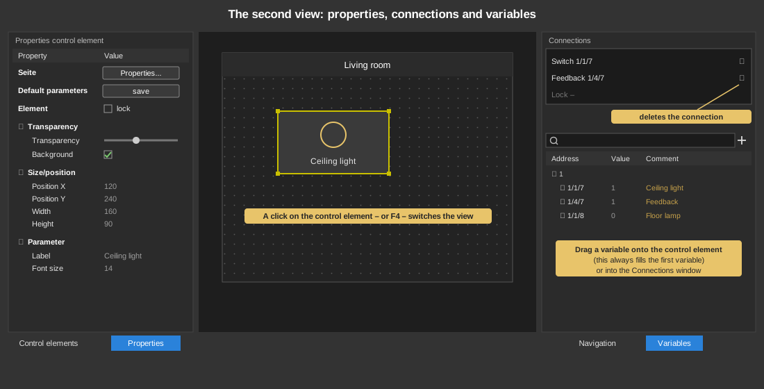
Click on the control element to change the view – F4
(switch view) does the same. With a click on the page, the view switches
back to the selection of the control elements.
The properties are displayed on the left, the connections for the control
element on the upper right and the variables below them.
The properties window starts with the row Page:
the button "Properties..." opens all properties of the visu page in a
separate dialog. It can also be used when no control element is selected.
Below it follow the properties of the control element – default
parameters, lock element, transparency, size/position and the parameters of
the respective element. See general
parameters.
With Default parameters / save the
current settings are taken over as the default for new control elements of
the same type.
Tip: Double-clicking on a control
element Block selects the connected addresses in the address window.
Linking variables
There are two ways to connect a variable to the control element:
- Drag the variable from the variable window onto the control element;
this always connects the first variable.
- Drag the variable from the variable window into the Connections
window.
To delete a connection, click in the Connections window on the symbol to the
right of the entry.
Tip: Via the Connections window it
is also possible to connect several inputs/outputs at the same time. To do
this, select several variables in the variable window and drag them into the
Connections window; the variables are then connected one after the other.