 Styles
Styles
StylesMenu Project – Styles.
A style determines the appearance of the control elements from the area Building automation Block – colours, fonts, backgrounds and graphics. Elements from the other areas are not affected by it, they are set up individually.
Up to 20 styles can be created in a project. The control element Block Style switches between them – by hand or through a variable, so that a clock or a weather station can switch to a dark style at night.
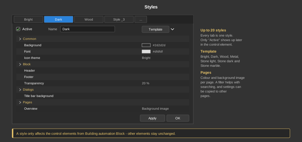
Every tab in the dialog is one style. For a style to be used at all, Active has to be set at the top – only active styles appear in the control element for selection later on. Next to it the Name is given that is shown there.
The button Template fills a style with a finished appearance:
A template is only a starting point, afterwards every single setting can be changed.
Setting up bright and dark for switching:
| Common | Basic colours of the style: background, font and the icon theme (light or dark symbols). The selection button of the control element Block Style is also set here. |
| Block | The appearance of the control elements themselves – header, footer, frame, background image, overlay and transparency. |
| Dialogs | The popup dialogs of the Block control elements: background, font, icon theme as well as the title bar with its own colour and its own icon theme. |
| Pages | Background colour and background image per page. Active determines whether the style should touch the page at all. In addition it can be chosen whether the page is shown horizontally or vertically and what the page change button looks like. |
With many pages the search field above the list helps. With Transfer settings to other pages… the settings of one page are copied to any other pages – and it can be chosen which settings go along.
Important: If a style is active, it overwrites the settings of the page. Colour and background in the page properties therefore only take effect as long as no style is used.
Tip: A finished example can be found under Help – Example projects.